
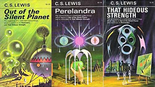
*Image Borrowed From Magnetmagazine.com*

*Image Borrowed From Flickr.com*

*Image Borrowed From Eatonspressbooks.com*


I'm not sure which covers are the originals, but due to the age of the series (1938, 1943, 1945) I think I can safely say that the covers have been redesigned many times already. In my search I even found another student's re-design project (of the same series of course).
Here are my own process sketches...


At this stage, I'm going with a simple representation of the overall 'space theme' with an image of each planet that the story takes place on for each cover (to create some form of continuity). Depending on the theme of the story (ie: Venus in the 2nd title) the shading/lighting will vary from bright to more ominous.
I've tried this sort of design before for a CD cover, so right away I have one or two application options. I could use Photoshop or even Blender (3D with UV mapping, but I've yet to decide how/where to get the terrain imagery for the planets, unless I can re-create them somehow) to create the planets and just add the stars, slight lens flares, and shading effects etc.
As for the font, I've decided to use a green, calculator like font that floats against the dark background (probably in green, so the contrast is sufficient (it's been tried many times and seems to work well), and so it resembles a star date placement like in the establishing shots of many space themed movies). Below is a quick and extremely lazy example of text placement in relation to the imagery.


As for the font, I've decided to use a green, calculator like font that floats against the dark background (probably in green, so the contrast is sufficient (it's been tried many times and seems to work well), and so it resembles a star date placement like in the establishing shots of many space themed movies). Below is a quick and extremely lazy example of text placement in relation to the imagery.


No comments:
Post a Comment